The rebranding for the construction company SK-71 began with the fact that we threw out everything related to the previous identity. The logo was so weak that it doesn't even need to be mentioned. We received a full carte blanche from our client and started looking for a form.
At first it seemed that the name was very complicated. It is completely abstract and consists of different symbols. The name seemed ugly.
But then, studying construction sites, communicating with builders and photographing their surroundings, we realized that construction is not about traditional beauty.
There is a special aesthetics in construction. It differs from the generally accepted one. This is about large forms. This is about the noble dirt on the hands. It's about striving for a better world. Builders are alien to decor. These are honest people.


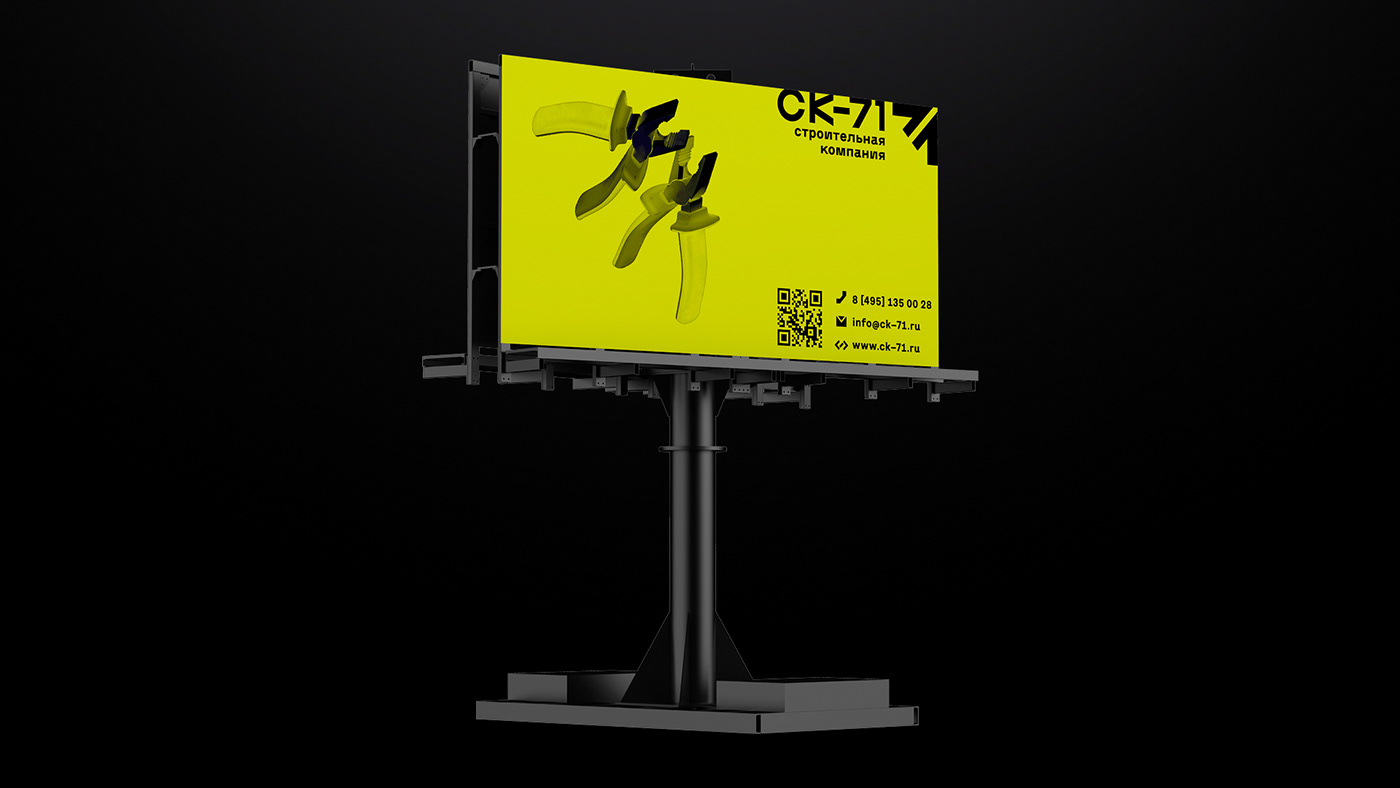

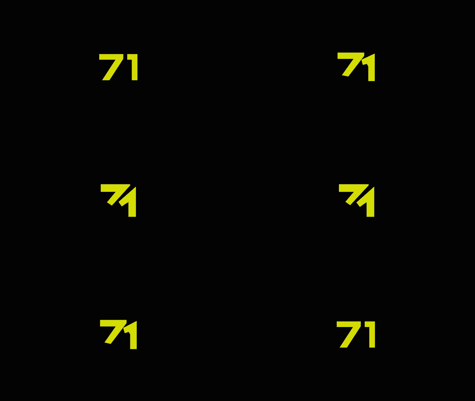
The corporate identity was supposed to be the same - honest, brutal, clear. We found a very simple but strong form - an arrow pointing upwards to the right. The arrow is a stylized inscription "71". Its symbolic content is the desire for growth, change, progress.


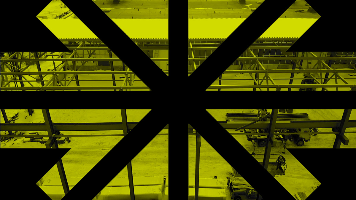
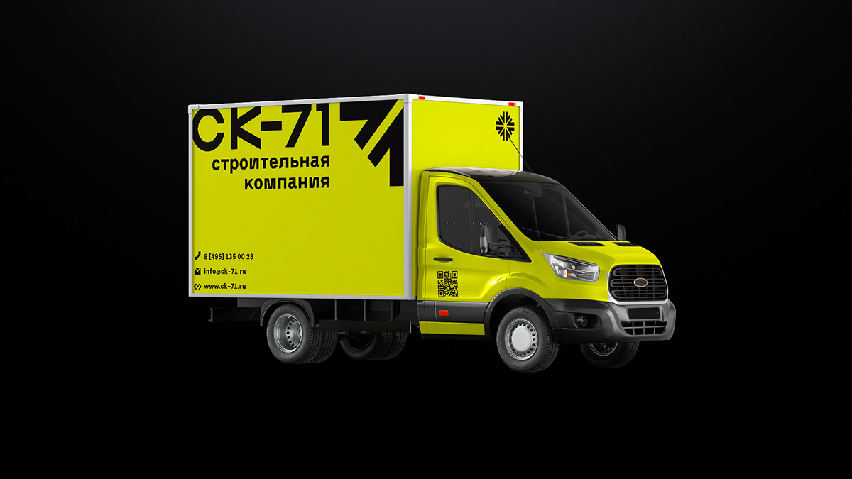
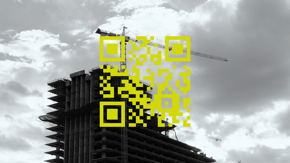
This strong form has gathered all the visual part around it. We added the color of the workers' vests, diluted with brutal typography and powerful patterns - this is how the SK-71 style was created.


